Introduction:
Shipeezi is a SaaS company providing integrated, data-driven solutions for the supply chain and logistics industry. They have Multiple products including web & mobile application for managing Supply chain, logistics & Shipment tracking tasks.
Problem Statement:
Over time, the product had become difficult to use. The interface looked different across screens, components were repeated unnecessarily, and key actions were placed in confusing spots.
All of this led to a poor experience for both users and the team maintaining the product.
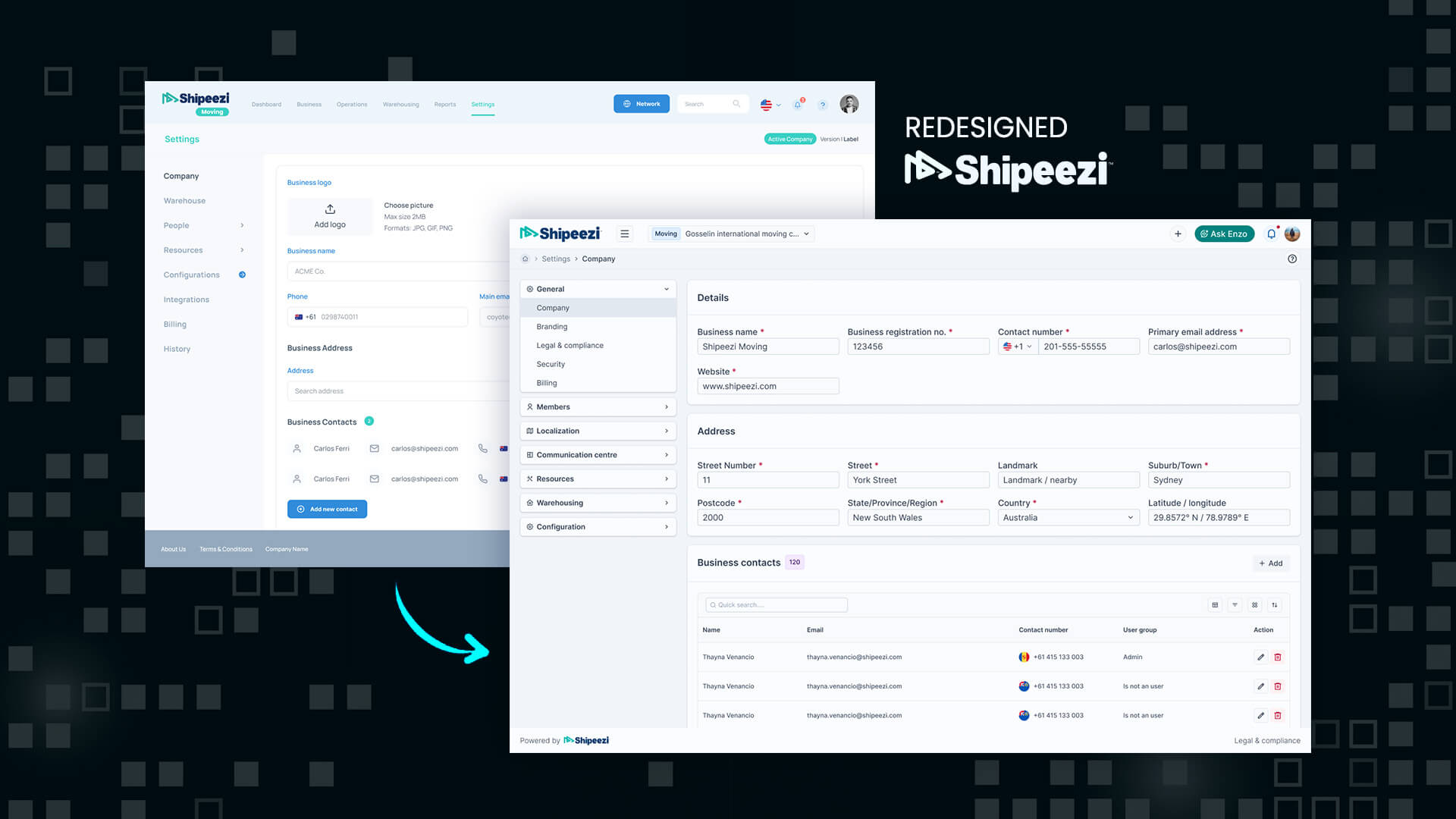
A Quick Look at the Result
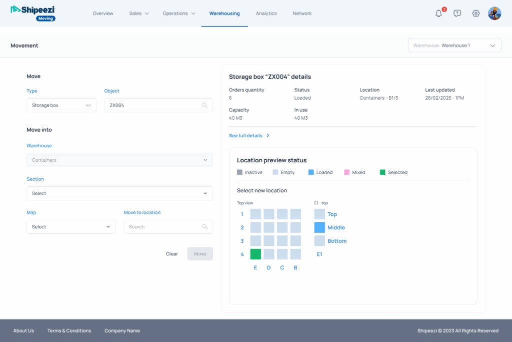
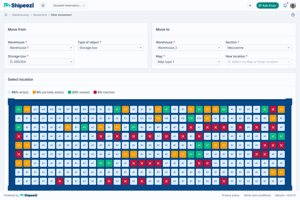
After the redesign, the product felt much more put together. It looked consistent and was easier to use.
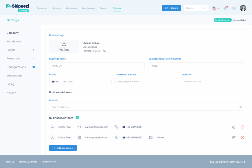
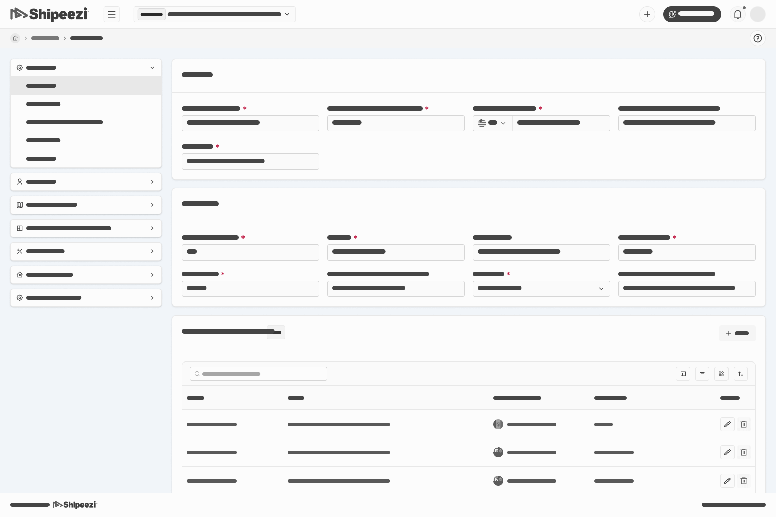
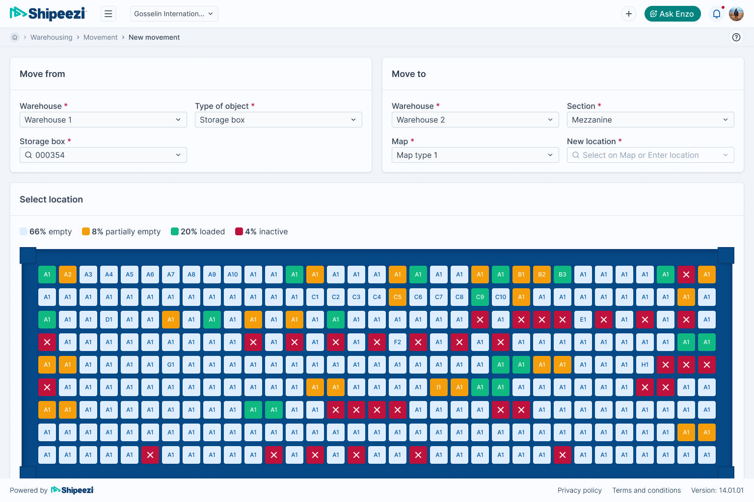
Old UI
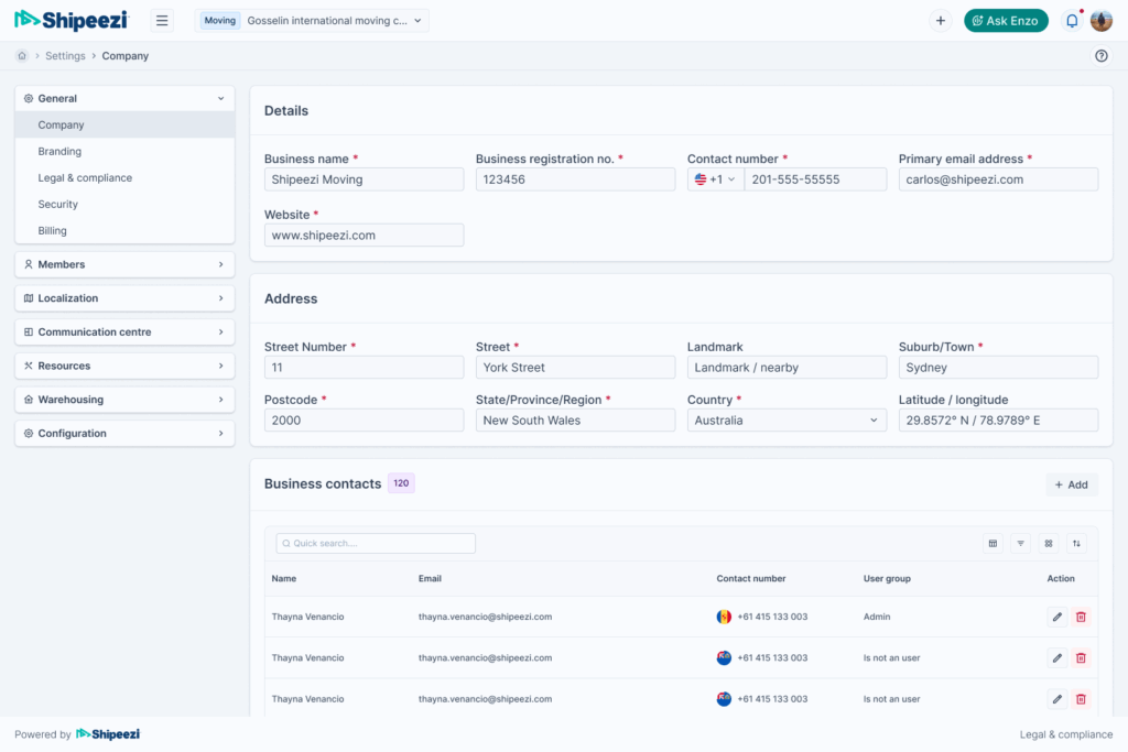
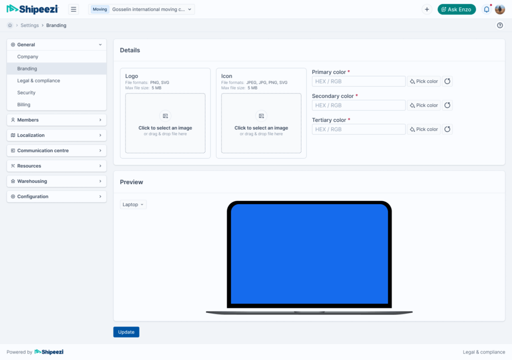
New UI
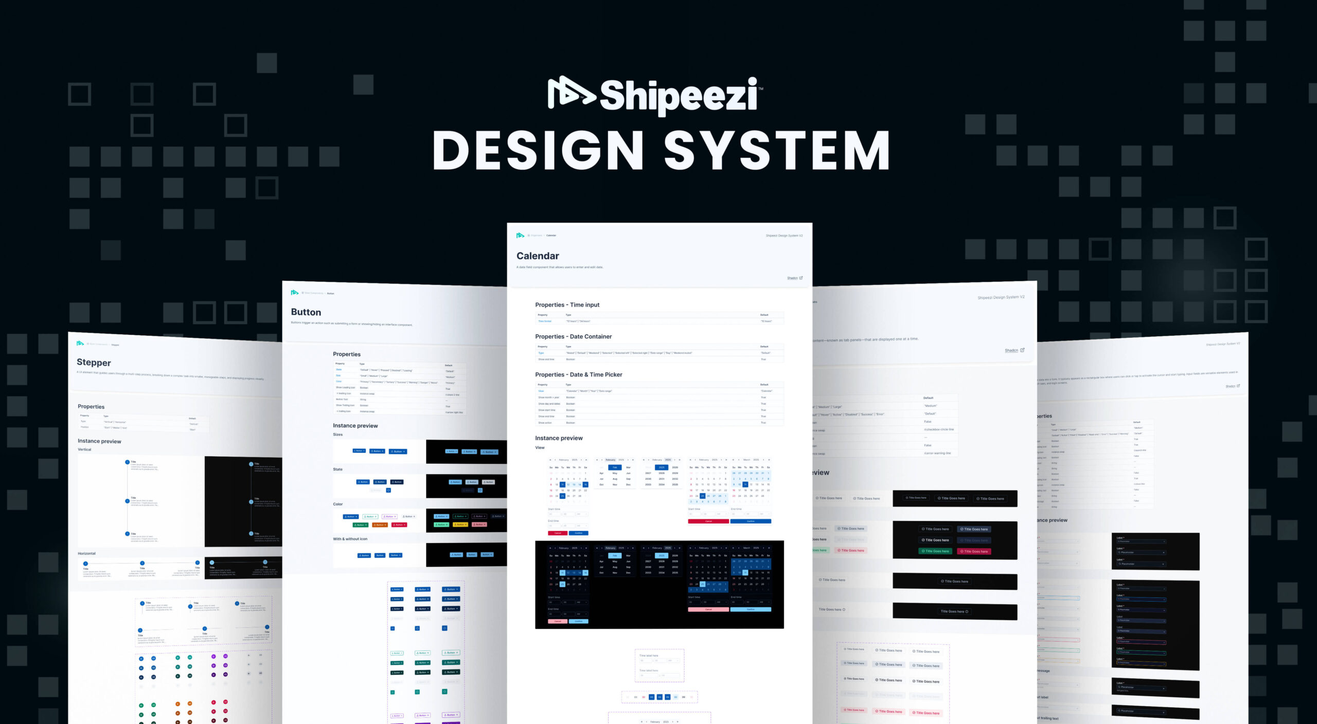
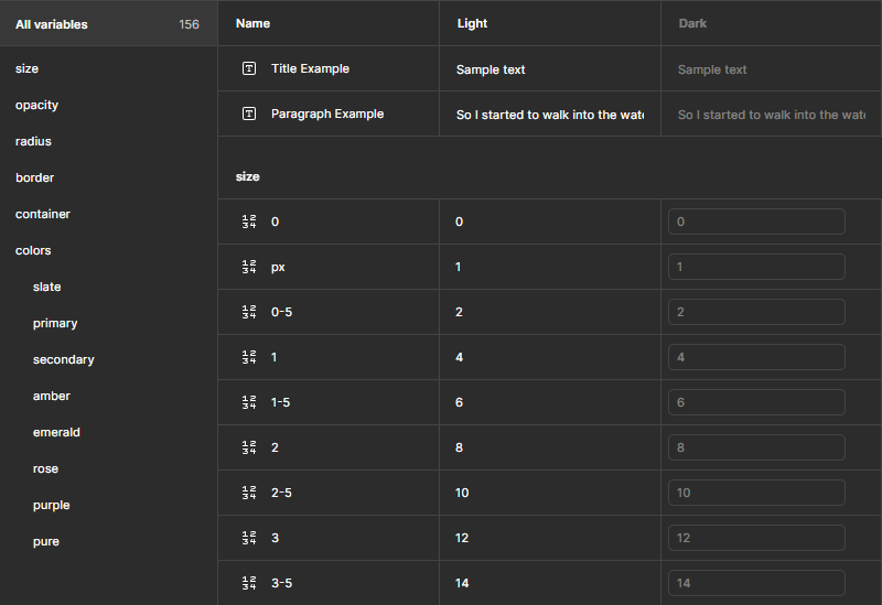
Project overview:
As a UI/UX Designer, I worked on identifying the issues to redesigning the full interface. I also used our new design system to make sure everything followed the same visual rules and patterns.
| Role | Team Size | Company | Design Guideline |
|---|---|---|---|
| UI/UX Designer | 2 | Shipeezi.com | Shipeezi Design System V2 |
Process & Steps:
Discover
User Surveys
Interviewed real users about what wasn’t working for them
Secondary Research
Did some research on how similar SaaS platforms are designed
Identified key issues
- Inconsistent UI across modules
- Components were repeated unnecessarily
- Key actions were placed in confusing spots
- Poor UX flow, making simple actions unnecessarily complicated
Ideate & decide
Once the issues were clear, I started thinking through possible solutions, aligning with the product team on what needed fixing.
- Proposed the idea of redesigning the UI
- Aligned the idea with stakeholders and got it approved
I focused on making the interface more consistent, reducing the number of steps for common tasks, and improving placement of key buttons and features.
Objectives
- Create a consistent experience across the app
- Make common tasks faster and easier
- Use the new design system to support future updates
Wireframing
I created low-fidelity wireframes to map out the improved structure and flow. This helped in testing ideas quickly before going into detailed design.
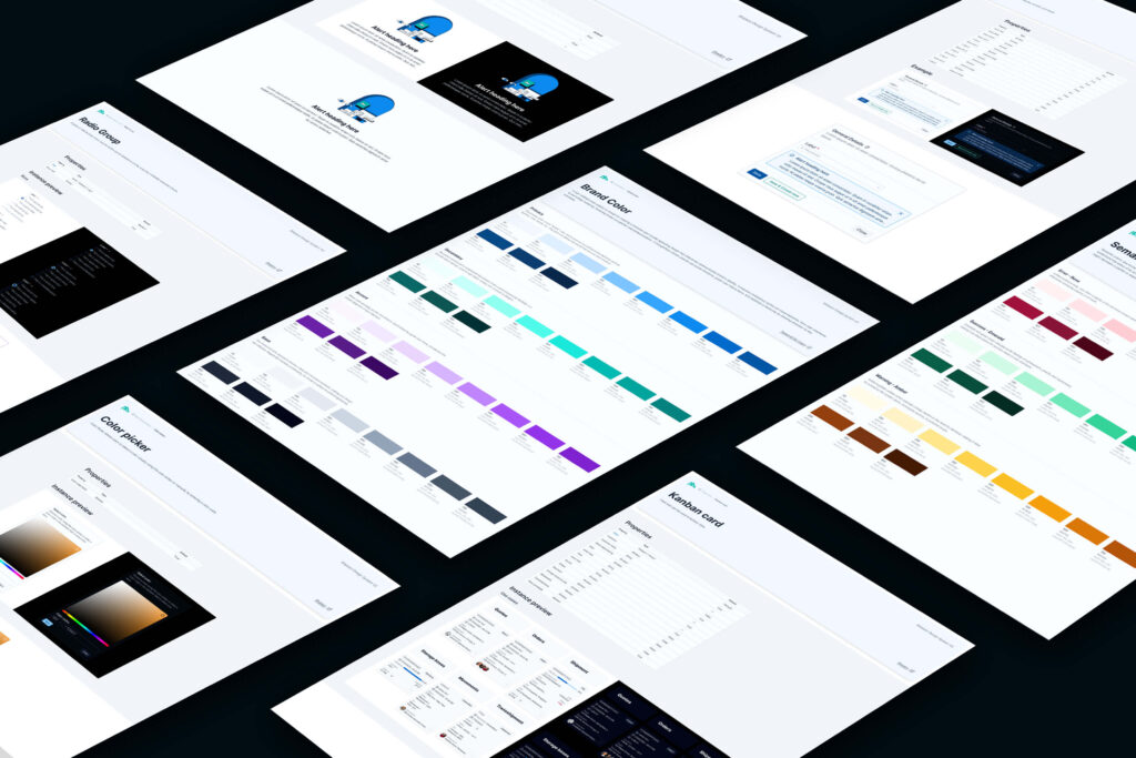
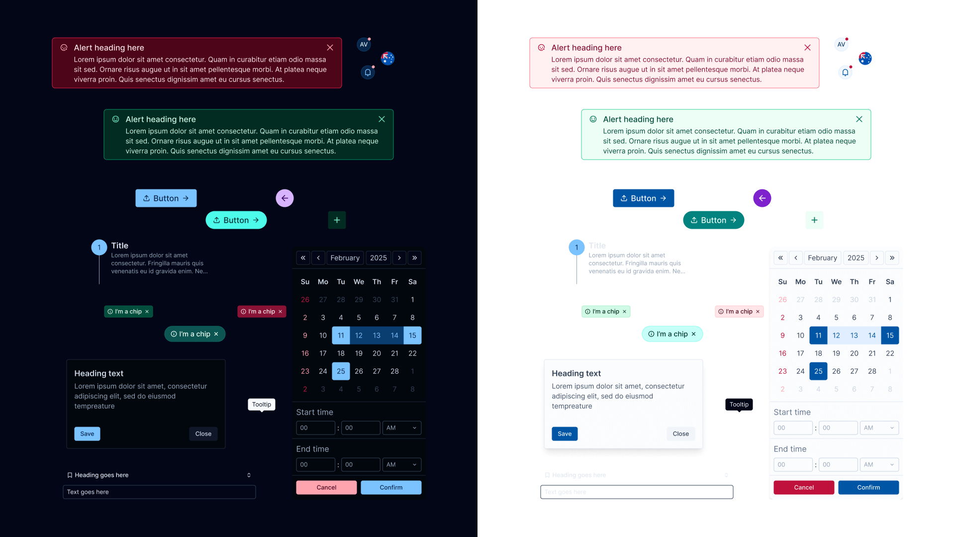
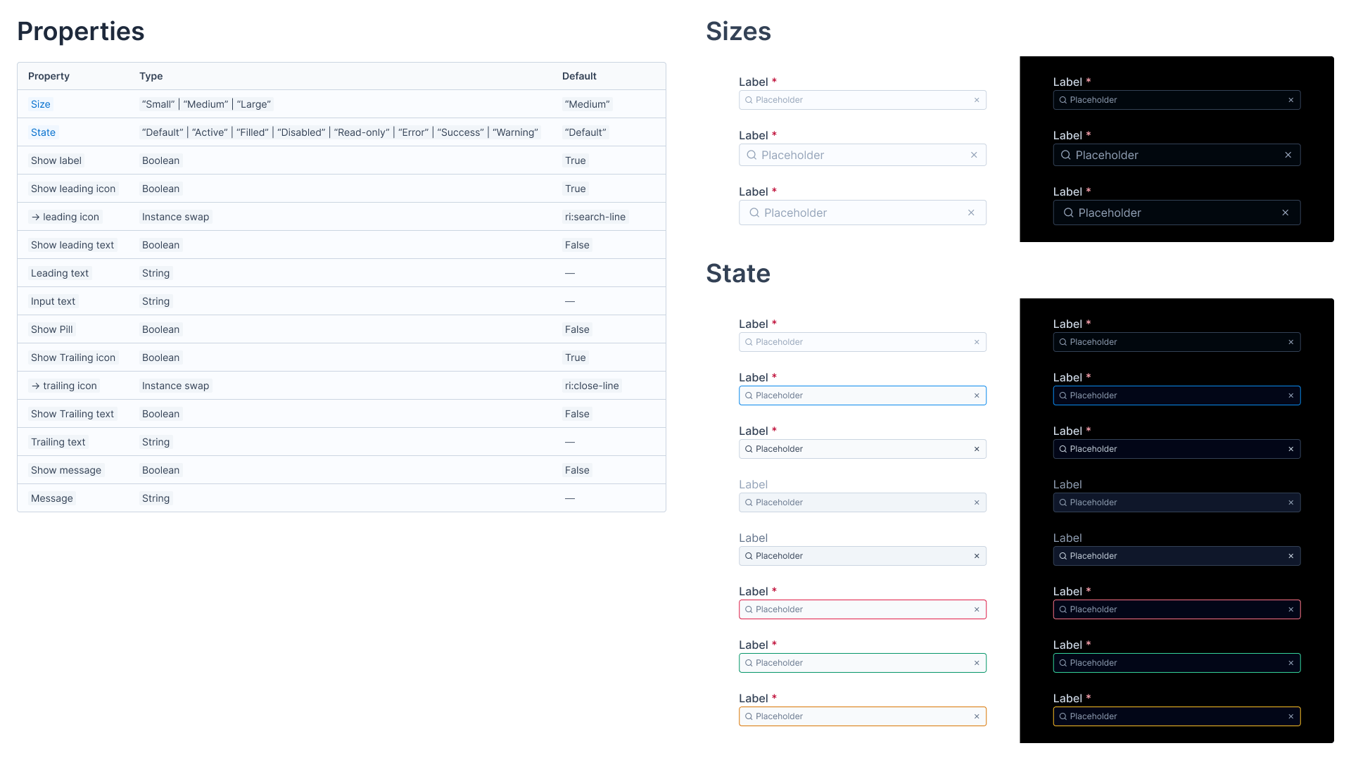
High-Fidelity Design
Using Figma and the Shipeezi design system, I redesigned all major screens. Made sure components were used properly, layouts followed a clean style, and everything aligned with our visual rules.
Prototyping
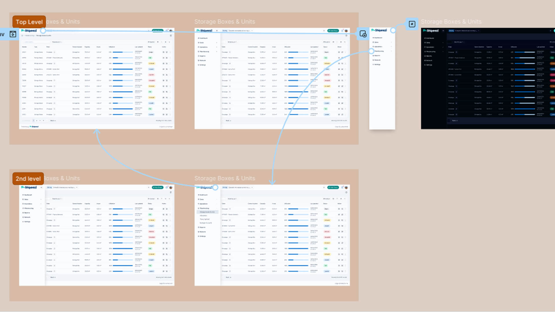
Created clickable prototypes to test how the redesigned screens would feel in action. These were shared internally for quick feedback.
Developer Handoff
- All documentation for components and their usage was already handled within the Shipeezi design system.
- The Figma screens were shared from figma with all necessary annotations to ensure clarity for the developers
Impact:
- The new UI felt cleaner and more connected
- Tasks became easier to perform
- Using the design system made future updates much simpler
- Feedback from the team and users was positive, and the product became easier to maintain
Key Learnings:
Real user feedback is powerful
Talking directly to users helped me understand problems I wouldn’t have caught just by looking at screens.
Small changes make a big difference
Something as simple as moving a “Save” button to the left improved usability in a noticeable way.
Design systems bring clarity
Reusing components from the design system made the redesign more consistent and easier to manage.
Testing early helps avoid bigger changes later
Wireframes and quick prototypes made it easier to get feedback and make changes early in the process.