Introduction:
Shipeezi is a SaaS company providing integrated, data-driven solutions for the supply chain and logistics industry. They have Multiple products including web & mobile application for managing Supply chain, logistics & Shipment tracking tasks.
Problem Statement:
Prior to the design system, Shipeezi’s digital products suffered from inconsistent UI patterns, duplicated components, and inefficient collaboration between design and development. Each new feature required custom styling, resulting in visual fragmentation and increased maintenance overhead.
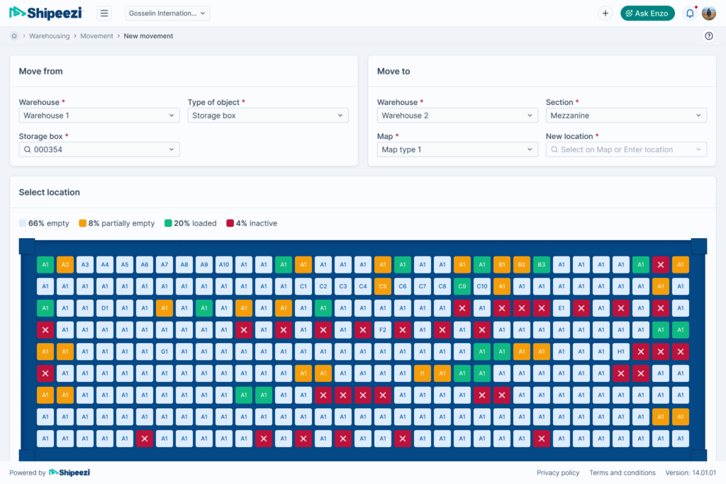
Old UI
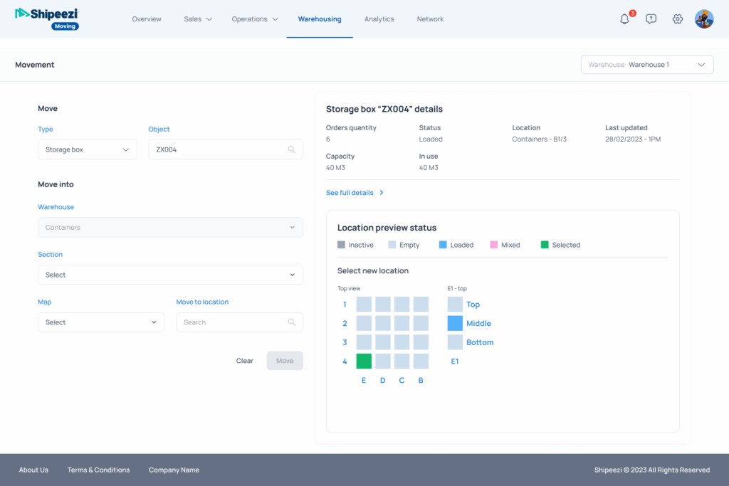
New UI
Project overview:
As the UX/UI Designer, I led the creation of a scalable, consistent, and developer-friendly design system to unify Shipeezi’s digital products and accelerate product development.
| Role | Team Size | Company | Design System Foundation |
|---|---|---|---|
| UI/UX Designer | 2 | Shipeezi.com | Tailwind CSS tokens |
Process & Steps:
Discover
User Surveys
Collected real feedback from users to understand how the product felt to use.
Competitive Research
Studied modern SaaS UI trends to benchmark expectations.
Internal Interviews
Spoke with developers to uncover challenges caused by redundant or mismatched components.
Identified key issues
- Inconsistent UI across different Shipeezi products
- Outdated, unmaintained components
- Duplicated components causing inefficient to develop a feature and also to make changes
- No single source of truth for design
Ideate & decide
- Brainstormed solutions
- Proposed building a fresh design system for Shipeezi
- Aligned the idea with stakeholders and got it approved
Objectives
Consistency
Establish a unified visual language across all products.
Efficiency
Enable rapid prototyping and development with reusable components.
Scalability
Ensure the system can grow with new features and branding needs.
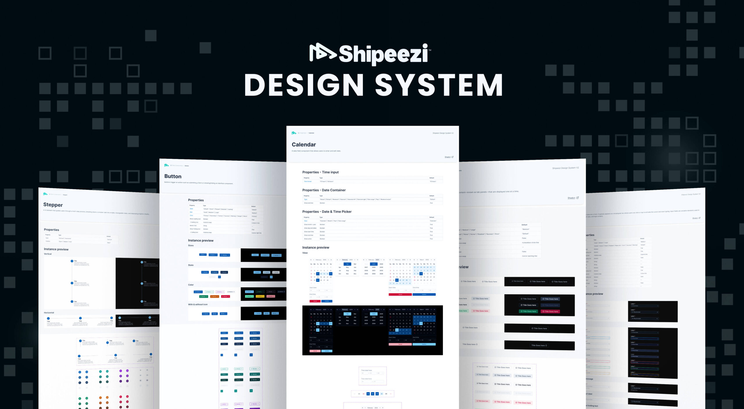
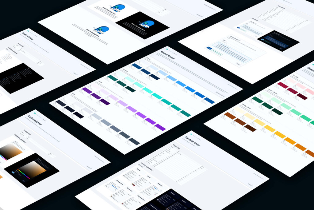
Design Tokens Setup (Tailwind-Based)
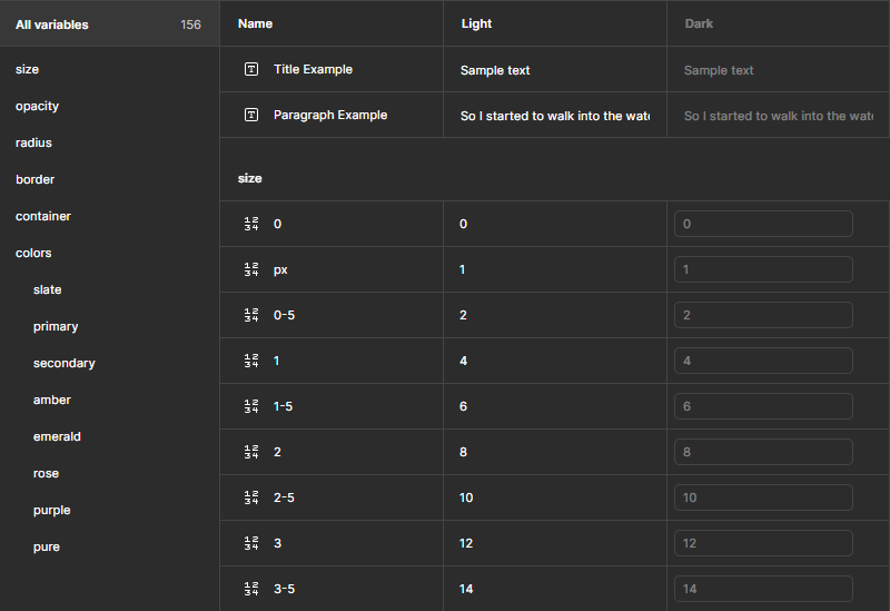
- Defined tokens for colors, typography, spacing, shadows, border radius, etc.
- Used Figma Variables to mirror Tailwind CSS, to ensure seamless alignment with developers
Component Library Creation
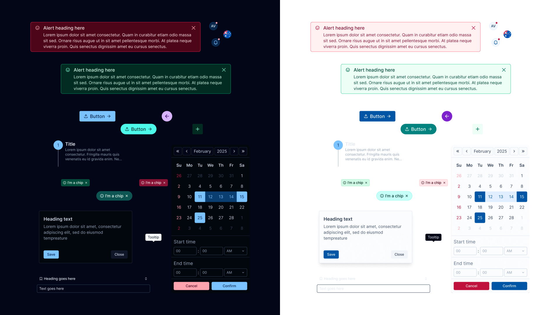
- Built a scalable library using atomic design principles
- Included: buttons, forms, navigation, modals, cards, etc.
- Each component had:
- States & variants (hover, disabled, active)
- Naming conventions
- Strings for light & dark mode
Documentation & Guidelines
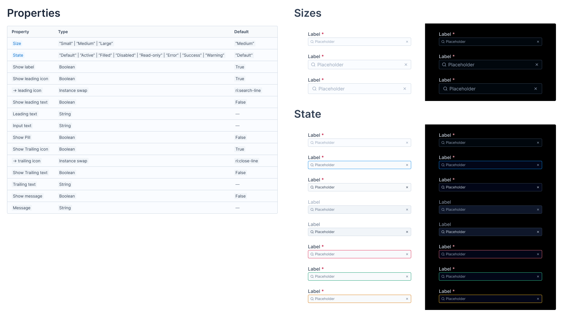
- Documented every component with:
- States & variants (hover, disabled, active)
- Naming conventions
- Strings for light & dark mode
- Provided a central source of truth accessible to designers and developers.
Governance & Iteration
- Regular feedback loops with stakeholders
- Continued iteration based on usage and team input
Impact:
- Consistency: Achieved a unified look and feel across all Shipeezi products, reducing UI inconsistencies.
- Efficiency: Enabled faster design and development cycles, with reusable components and tokens.
- Scalability: The system is future-proof, supporting new features, branding, and sub-brands with minimal effort.
- Collaboration: Improved communication and workflow between design and development, thanks to Tailwind-based tokens and clear documentation.
Key Learnings:
- Close alignment between design tokens and Tailwind CSS accelerates development and reduces friction.
- Comprehensive documentation and clear naming conventions are essential for adoption and scalability.
- Iterative feedback and collaboration are crucial for a sustainable design system.